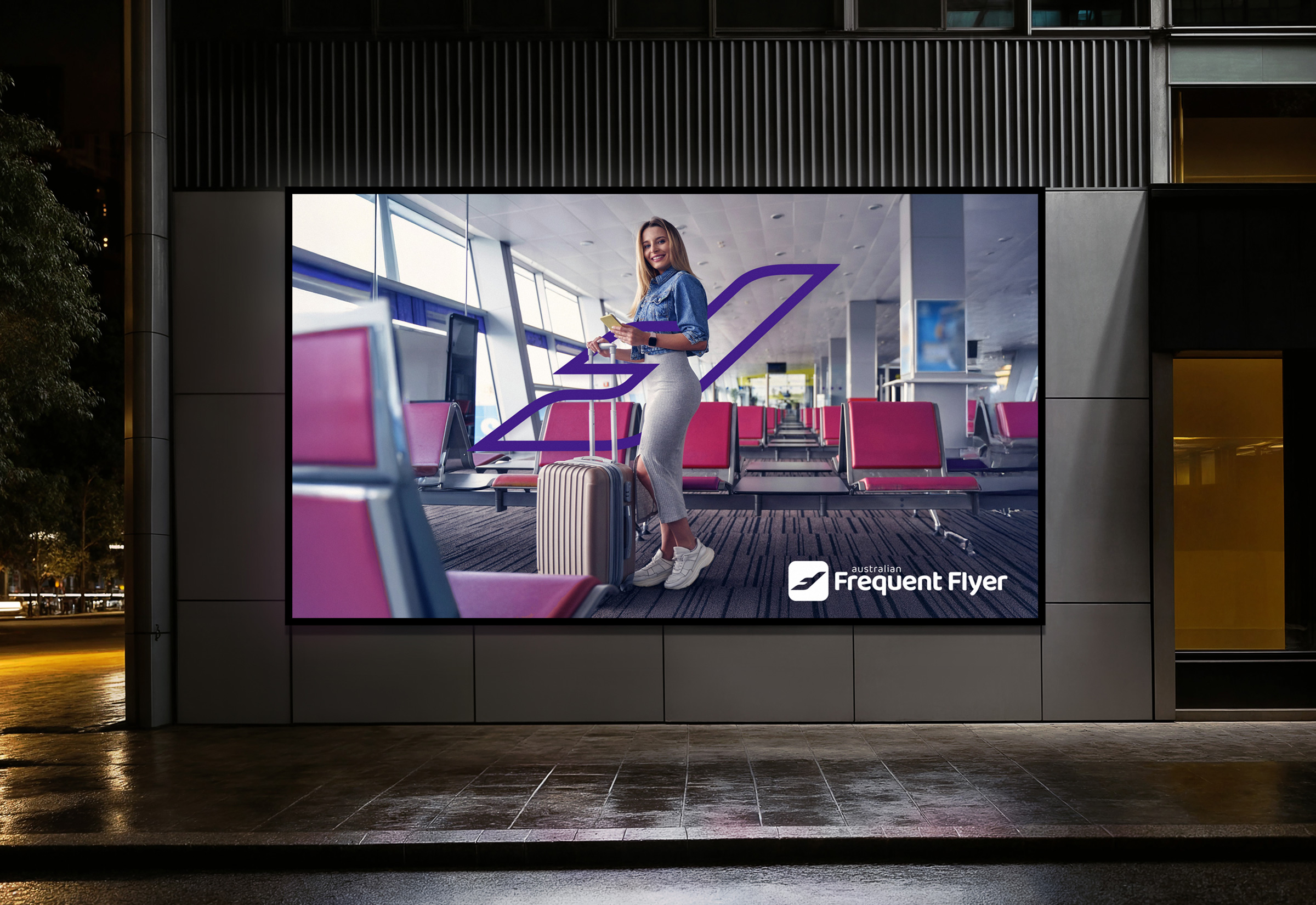
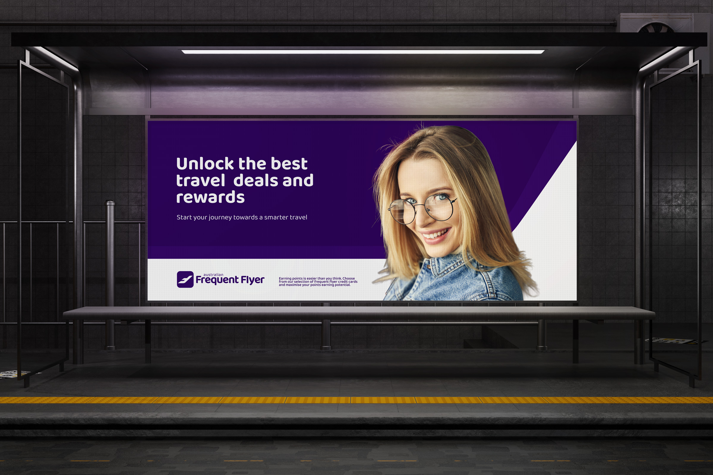
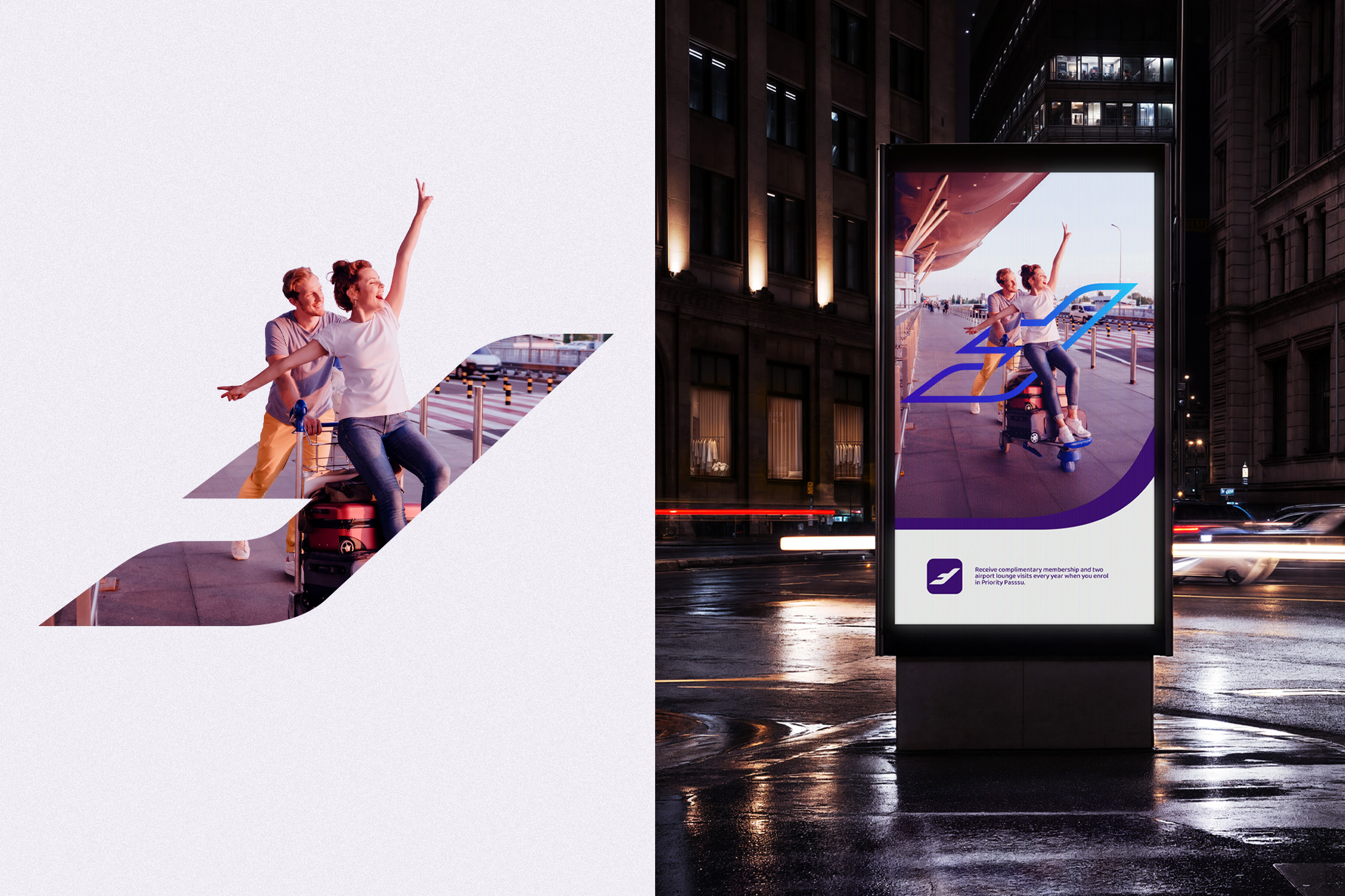
Australian Frequent Flyer had built a loyal community through quality content. As the platform grew, so did the opportunity to bring the visual identity into alignment with the brand’s expanding role and increasingly sophisticated audience. Dormand Design partnered with strategic brand Consultant, Chantal Walker, to evolve Australian Frequent Flyer into a cohesive, modern brand expression.
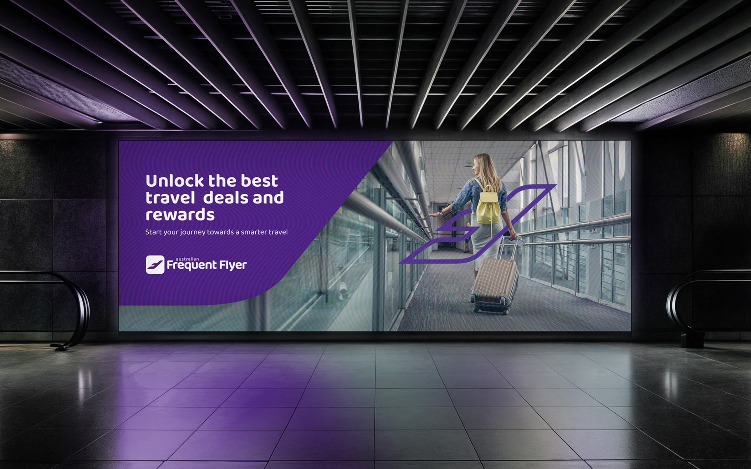
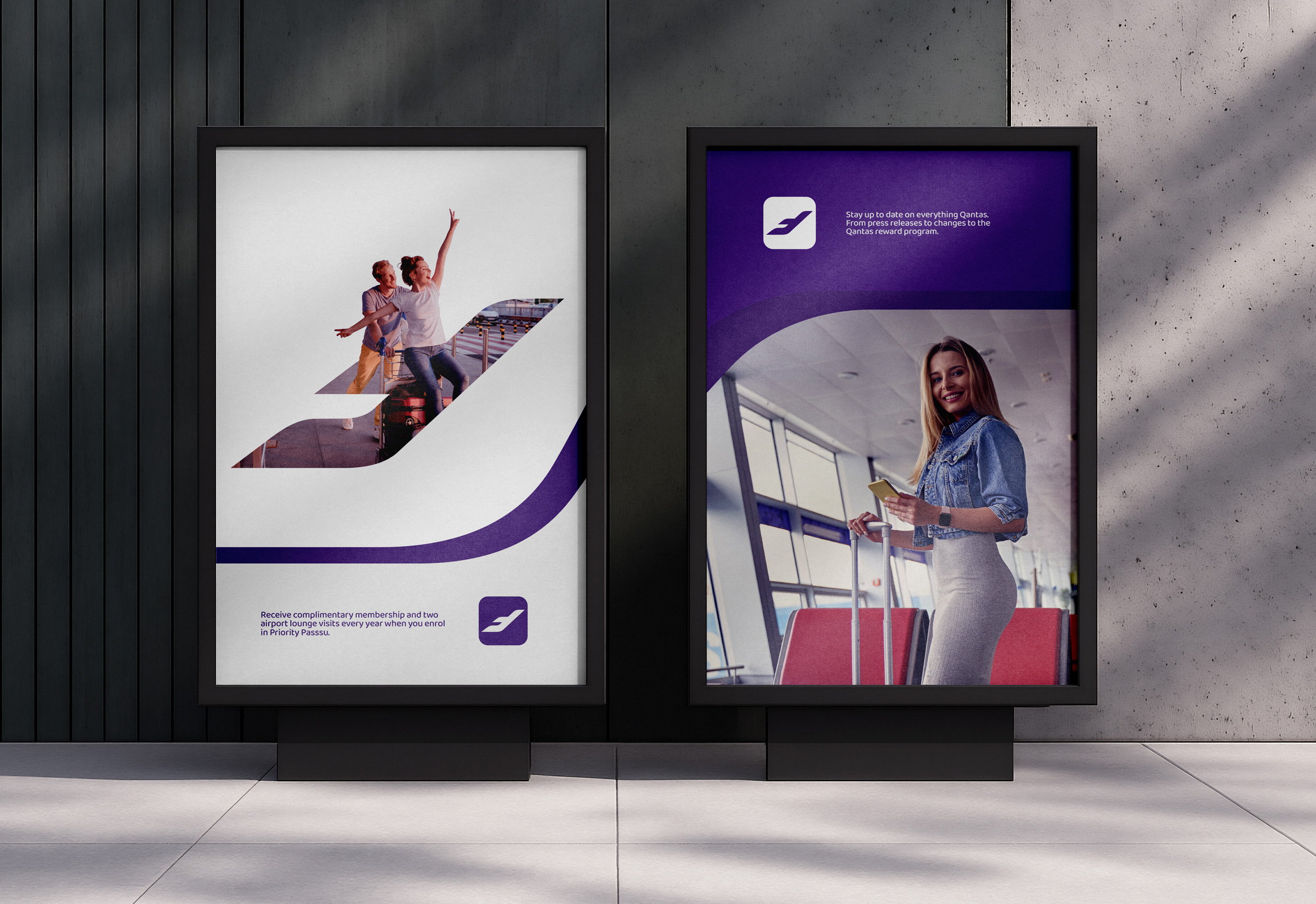
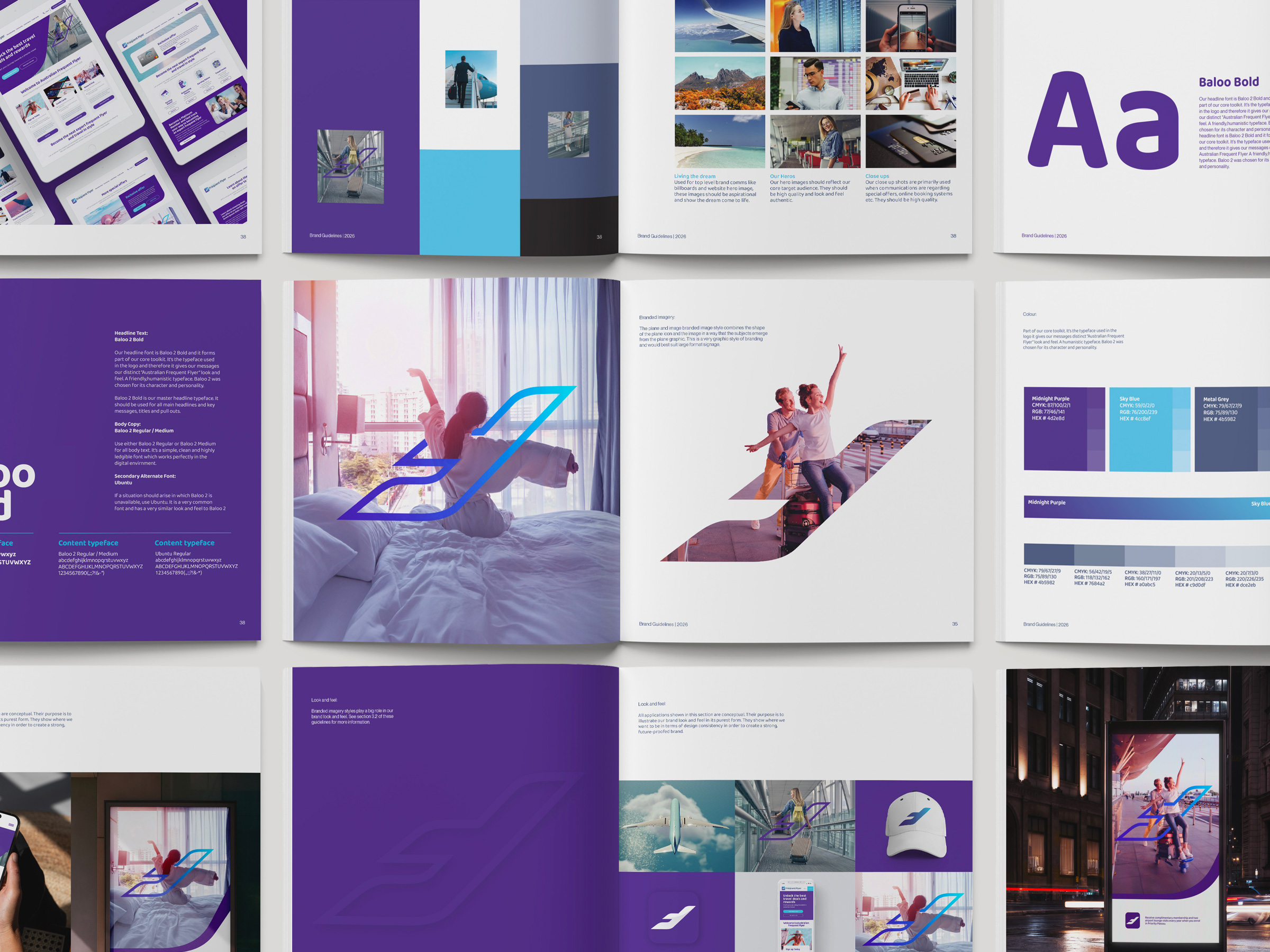
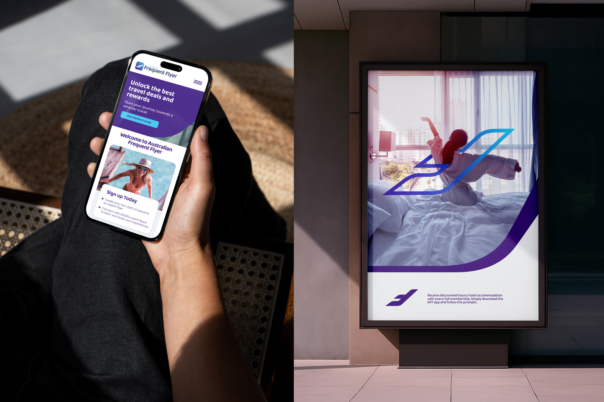
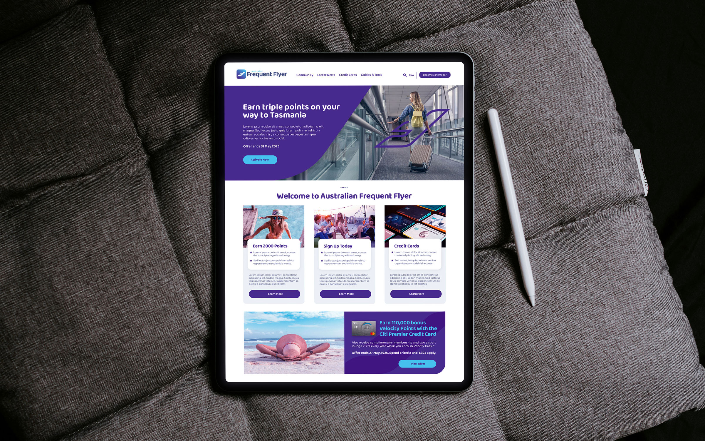
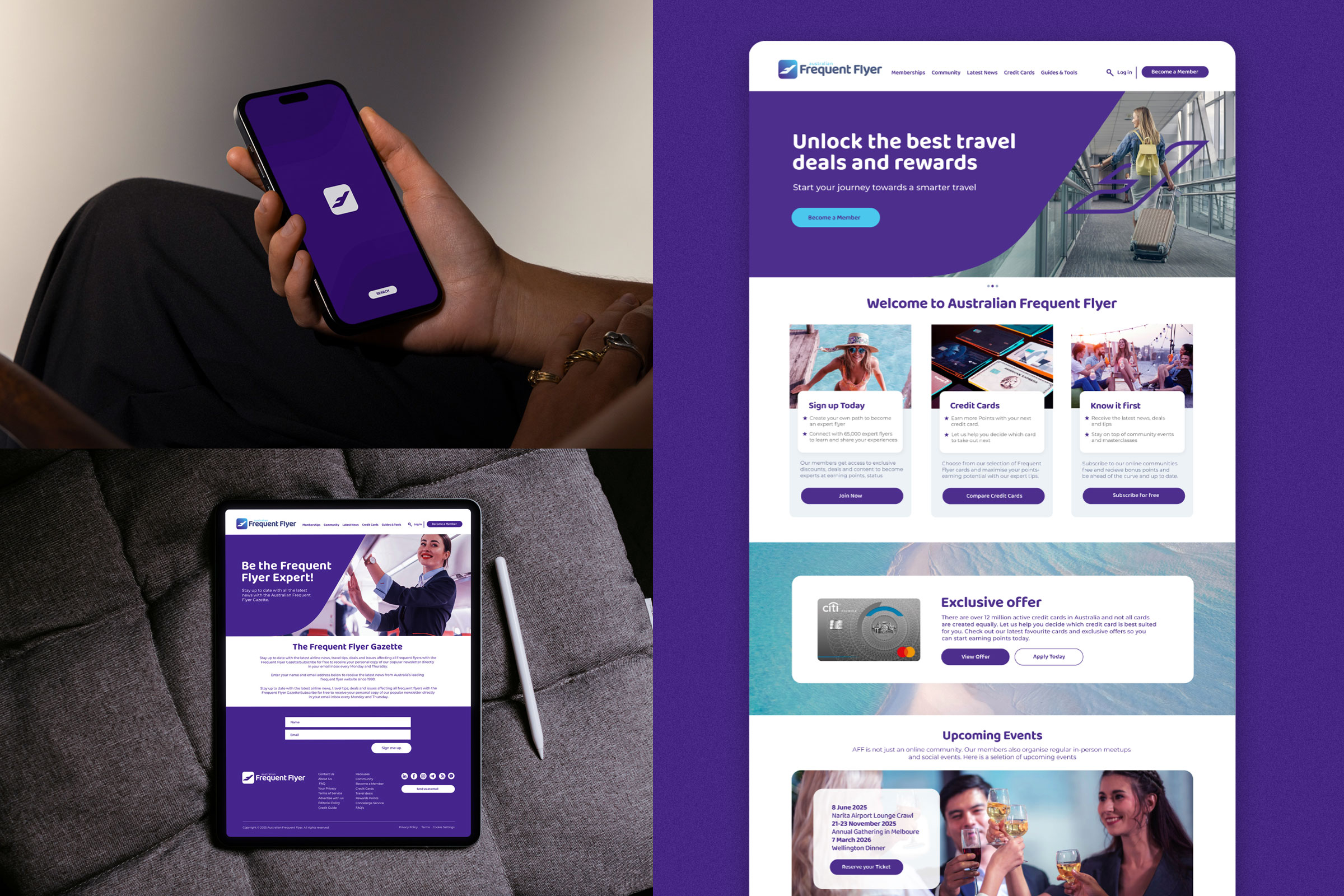
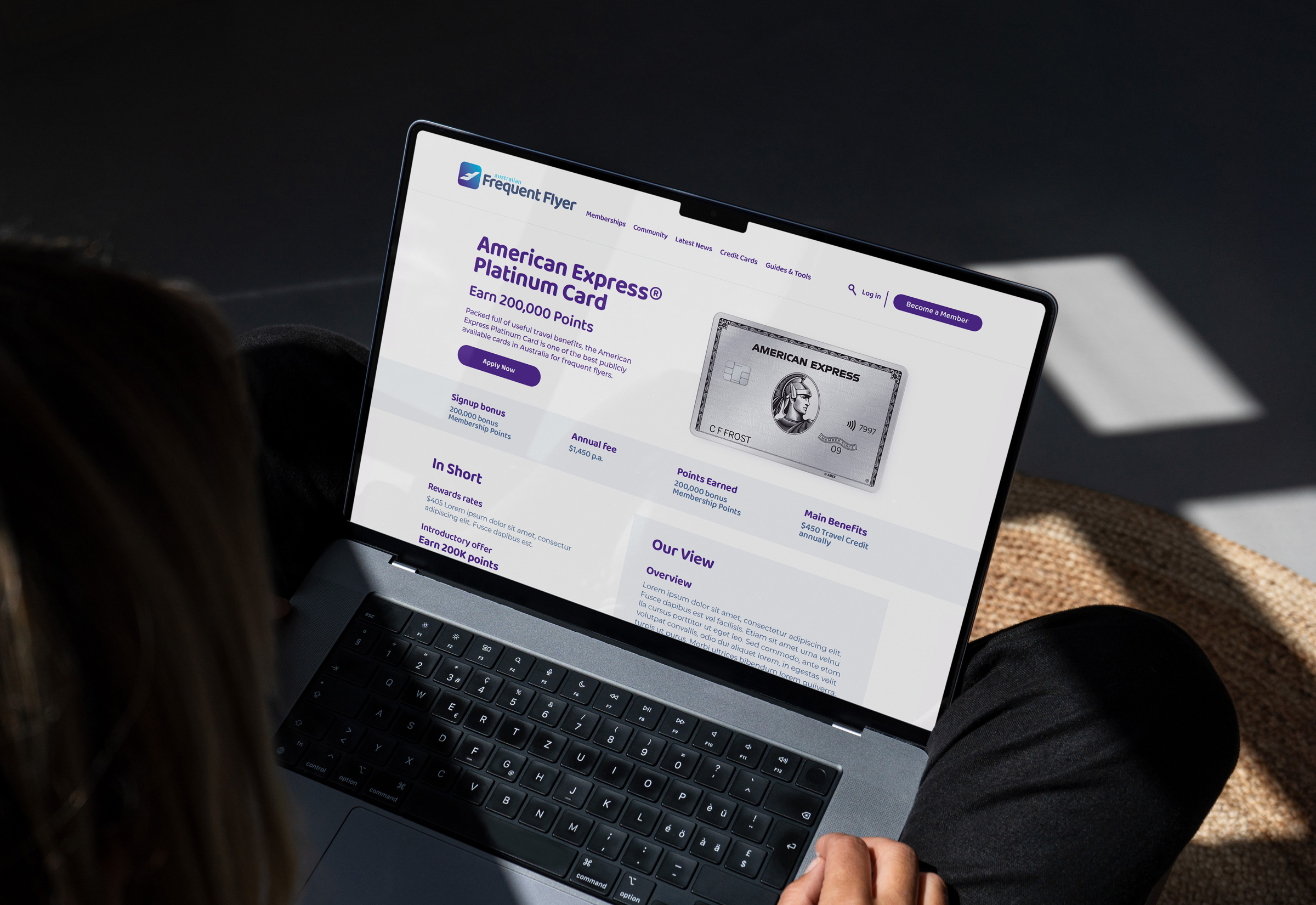
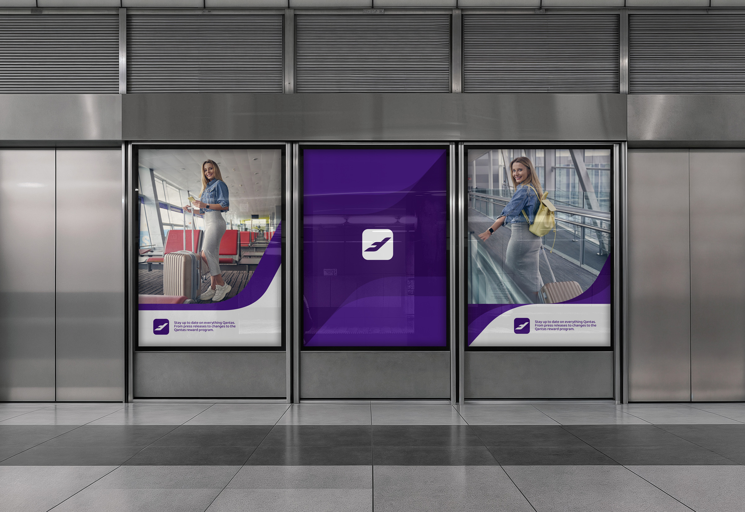
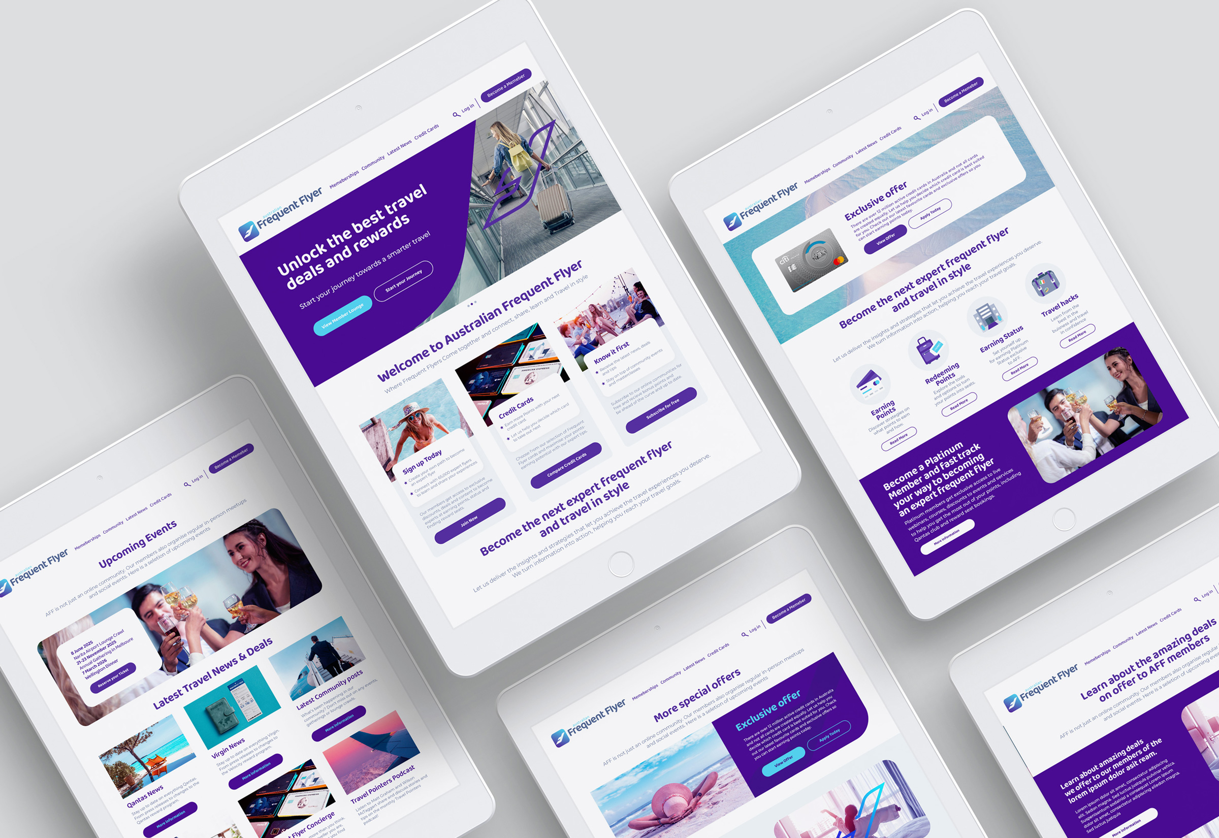
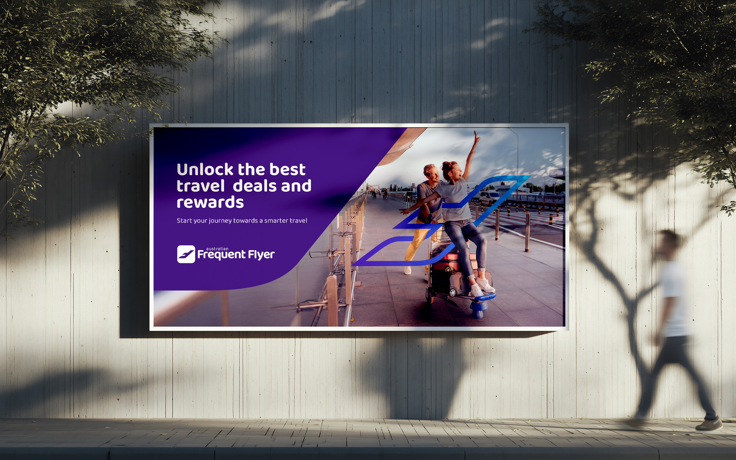
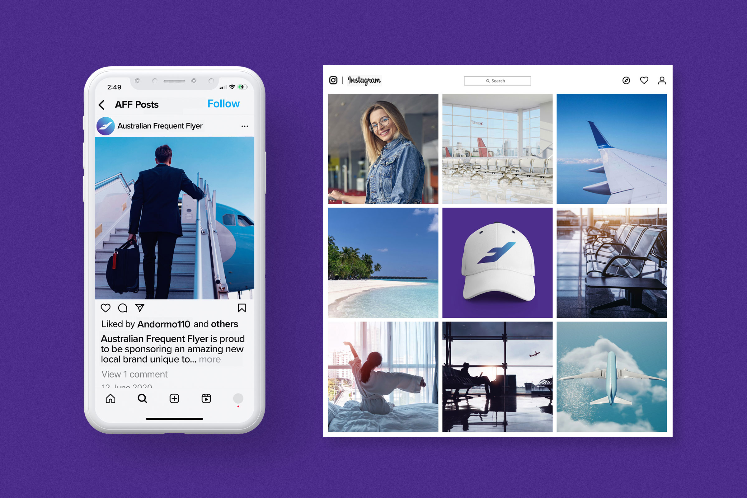
We started with fundamentals: a redesigned logo and corporate identity built for flexibility and digital performance. From there, we developed a complete design system with clear rules for typography, colour, layout and hierarchy. This brought structure across every touchpoint and created consistency at scale.
The transformation focused on reorganising how the brand communicates. We streamlined the visual language and refined information architecture, creating an intuitive framework that guides users through content naturally. The result is clearer, more purposeful navigation.
Well-designed brands build trust. When communications are consistent and built around user needs, they create credibility. Through disciplined design systems and customer-focused strategy, we evolved Australian Frequent Flyer into a contemporary brand that communicates with intention and positions the platform confidently for continued growth.